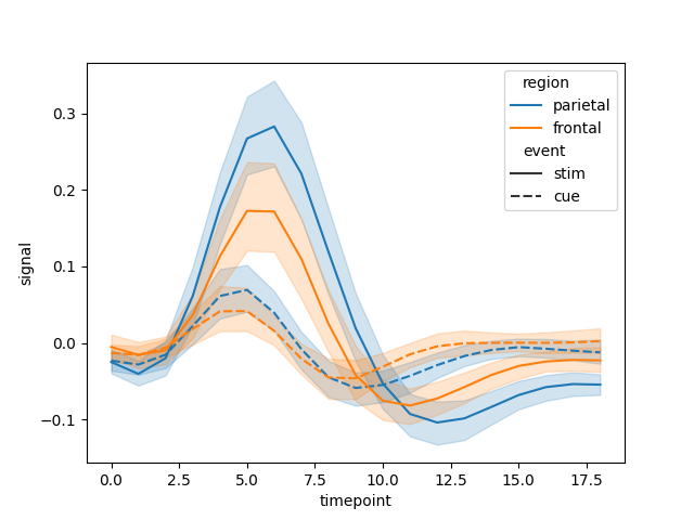
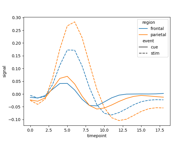
For some time I have been using plotly_express.line in order to generate dynamic plots. I personally think that this is a great tool that has an API very similar to the one from seaborn. Unfortunately, I missed the possibility to plot continuous error bands with plotly in the same manner that seaborn does when multiple samples are present for each category. For this purpose I created a modules that does this computation in the same manner that seaborn does. This module actually takes parts from the core of seaborn to compute the standard deviation and the confidence interval. Let’s get into the code to see how it’s performance.
Code implementation in python
In order to use this module we need to import ploty_express, numpy, seaborn, itertools, plotly and pandas
import plotly_express as px
import seaborn as sns
import pandas as pd
import numpy as np
from seaborn.relational import bootstrap
from seaborn.utils import ci as ci_func
import matplotlib.pyplot as plt
import itertools
import plotly.graph_objs as go


def line(data_frame: pd.DataFrame,
         x="timepoint",
         y="signal",
         ci=95,
         estimator="mean",
         n_boot=1000,
         sort=True,
         color="region",
         error_y=None,
         error_y_minus=None,
         line_dash="event",
         **kwargs):
    cat_vars = {"color": color, "line_dash": line_dash}
    cat_vars = {key: cat_vars[key] for key in cat_vars if cat_vars[key] is not None}
    variables = dict(x=x, y=y)
    variables.update(cat_vars)
    data = pd.DataFrame()
    data['x'] = data_frame.get(variables.get('x'))
    data['y'] = data_frame.get(variables.get('y'))
    for key in cat_vars:
        data[key] = data_frame[cat_vars[key]]
    if error_y is not None:
        data["error_y"] = data_frame[error_y]
    if error_y_minus is not None:
        data["error_y_minus"] = data_frame[error_y_minus]
    grouping_vars = list(cat_vars.keys())
    x_l = []
    y_l = []
    low_l = []
    high_l = []
    color_l = []
    dash_l = []
    for sub_vars, sub_data in iter_data(data=data, variables=variables, grouping_vars=grouping_vars):
        if sort:
            sort_vars = ["units", "x", "y"]
            sort_cols = [var for var in sort_vars if var in variables]
            sub_data = sub_data.sort_values(sort_cols)
        sub_data = sub_data.dropna()
        null = pd.Series(index=data.index, dtype=float)
        x_v = sub_data.get("x", null)
        y_v = sub_data.get("y", null)
        if error_y is None:
            x_v, y_v, y_ci = aggregate(vals=y_v, grouper=x_v, estimator=estimator, ci=ci, n_boot=n_boot, sort=sort)
            low_l += list(y_ci["low"].values)
            high_l += list(y_ci["high"].values)
        elif error_y_minus is None:
            low_l += list(y_v + sub_data.get("error_y").values)
            high_l += list(y_v - sub_data.get("error_y").values)
        else:
            low_l += list(y_v + sub_data.get("error_y_minus").values)
            high_l += list(y_v - sub_data.get("error_y").values)
        x_l += list(x_v)
        y_l += list(y_v)
        if sub_vars.get("color"):
            color_l += [sub_vars.get("color") for _ in x_v]
        if sub_vars.get("line_dash"):
            dash_l += [sub_vars.get("line_dash") for _ in x_v]

    agg = {variables.get('x'): x_l, variables.get('y'): y_l, "low": low_l, "high": high_l}
    if color_l:
        agg[variables.get("color")] = color_l
    if dash_l:
        agg[variables.get("line_dash")] = dash_l
    agg = pd.DataFrame(agg)
    fig = px.line(data_frame=agg, x=x, y=y, color=color, line_dash=line_dash, **kwargs)
    traces = fig.data
    for tr in traces:
        name = tr.name
        categories = name.replace(' ', '').split(',')
        tmp_df = get_subdata(agg, categories)
        y_high = list(tmp_df.high.values)
        y_low = list(tmp_df.low.values)
        band = go.Scatter(
            name=name,
            legendgroup=tr.legendgroup,
            x=list(tr.x) + list(tr.x[::-1]),  # x, then x reversed
            y=y_high + y_low[::-1],  # upper, then lower reversed
            fill='toself',
            fillcolor=hex_to_rgba(tr.line.color),
            line=dict(color=hex_to_rgba(tr.line.color)),
            hoverinfo="skip",
            showlegend=False
        )
        fig.add_trace(band)
    return fig
Now we need to define a method that iterates over the categorical classes defined by color and line_dash.
def iter_data(data, variables, grouping_vars=None, reverse=False):
    if grouping_vars is None:
        grouping_vars = []
    elif isinstance(grouping_vars, str):
        grouping_vars = [grouping_vars]
    elif isinstance(grouping_vars, tuple):
        grouping_vars = list(grouping_vars)

    # Always insert faceting variables
    facet_vars = {"col", "row"}
    grouping_vars.extend(
        facet_vars & set(variables) - set(grouping_vars)
    )

    # Reduce to the semantics used in this plot
    grouping_vars = [
        var for var in grouping_vars if var in variables
    ]

    if grouping_vars:

        grouped_data = data.groupby(
            grouping_vars, sort=False, as_index=False
        )

        grouping_keys = []
        for var in grouping_vars:
            grouping_keys.append(var_levels(data, var).get(var, []))

        iter_keys = itertools.product(*grouping_keys)
        if reverse:
            iter_keys = reversed(list(iter_keys))

        for key in iter_keys:

            # Pandas fails with singleton tuple inputs
            pd_key = key[0] if len(key) == 1 else key

            try:
                data_subset = grouped_data.get_group(pd_key)
            except KeyError:
                continue

            sub_vars = dict(zip(grouping_vars, key))

            yield sub_vars, data_subset

    else:

        yield {}, data

def var_levels(data, variables):
    _var_levels = dict()
    if isinstance(variables, str):
        variables = [variables]
    for var in variables:
        try:
            _var_levels[var] = list(data.get(var).unique())
            _var_levels[var].sort()
        except AttributeError:
            pass
    return _var_levels
Once we have created the data groups for each category, we can aggregate them to compute the standard deviation or the confidence interval with bootstrap. This will define the error band to be plotted.
def aggregate(vals, grouper, estimator="mean", ci="sd", n_boot=1000, seed=None, sort=True):
    """Compute an estimate and confidence interval using grouper."""
    func = estimator

    # Define a "null" CI for when we only have one value
    null_ci = pd.Series(index=["low", "high"], dtype=float)

    # Function to bootstrap in the context of a pandas group by
    def bootstrapped_cis(vals):

        if len(vals) <= 1:
            return null_ci

        boots = bootstrap(vals, func=func, n_boot=n_boot, seed=seed)
        cis = ci_func(boots, ci)
        return pd.Series(cis, ["low", "high"])

    # Group and get the aggregation estimate
    grouped = vals.groupby(grouper, sort=sort)
    est = grouped.agg(func)

    # Exit early if we don't want a confidence interval
    if ci is None:
        return est.index, est, None

    # Compute the error bar extents
    if ci == "sd":
        sd = grouped.std()
        cis = pd.DataFrame(np.c_[est - sd, est + sd],
                           index=est.index,
                           columns=["low", "high"]).stack()
    else:
        cis = grouped.apply(bootstrapped_cis)

    # Unpack the CIs into "wide" format for plotting
    if cis.notnull().any():
        cis = cis.unstack().reindex(est.index)
    else:
        cis = None

    return est.index, est, cis
At the end of our line method we iterate over the data in the generated plotly figure in order to get the trace names,
and the line color, such that the error bans have the same color but with a different transparency. To transform the colors
we convert the hex color-code defined by plotly to RGBA. First we get the data corresponding to each trace, and then we
compute the color.
def get_subdata(df: pd.DataFrame, categories: list):
    if isinstance(categories, str):
        categories = [categories]
    for cat in categories:
        col = df.columns[df.isin([cat]).any()]
        if len(col) != 1:
            raise ValueError(f"Can not infer column name from categorical value {cat}, Two columns should not have "
                             f"the same element in both columns for column name inference to succeed")
        else:
            col = col[0]
        tmp_df = df[df[col] == cat]
        categories.remove(cat)
        if not categories:
            return tmp_df
        else:
            return get_subdata(tmp_df, categories)
def hex_to_rgba(color: str, transparency=0.2):
    hex = color.lstrip('#')
    hlen = len(hex)
    rgba = tuple(int(hex[i:i+hlen//3], 16) for i in range(0, hlen, hlen//3)) + (transparency,)
    return f'rgba{str(rgba)}'
This addition of new traces to the created figure is not really elegant, but it is the only solution I could find without
having to modify the core of plotly-express.
Let’s see now how the plot might look with an example.
fmri = sns.load_dataset('fmri')
figure = line(data_frame=fmri, x="timepoint", y="signal", color="region", line_dash="event")
figure.write_html("plot.html")
figure = sns.lineplot(data=fmri, x="timepoint", y="signal", hue="region", style="event")
plt.savefig("plot.png")
We can see now that the results are very similar.

In addition, if you have already computed the errors and are included in the dataframe as columns, you can pass this
parameter in order to override the aggregation functionality. Let’s see this in the same example as before, but now we
aggregate the results manually before passing it to the plotting function. You can also pass error_y_minus to the plot
function in case the error band should be asymmetric.
fmri = sns.load_dataset('fmri')
fmri = fmri.groupby(["region", "event", "timepoint"], as_index=False).agg(["mean", "std"]).reset_index()
fmri.columns = ["region", "event", "timepoint", "signal", "std"]

figure = line(data_frame=fmri, x="timepoint", y="signal", color="region", line_dash="event", error_y="std")
figure.write_html("plot_agg.html")
figure = sns.lineplot(data=fmri, x="timepoint", y="signal", hue="region", style="event", ci="std")
plt.savefig("plot_agg.png")

Finally, we can profile the performance of each method to see how much time it takes to plot the results using each implementation. You can see that our custom implementation (with error bands) takes nearly 4 times longer than plotly (without error bands) and around 3 times longer than seaborn. This is due to the fact that we are iterating over the already created figure and updating the traces of the figure in order to generate the error bands. The plotting time is still very small and not really noticeable at this scale. The plotting time would be definitely reduced if such implementation would be implemented at the core level of plotly-express instead of having to update the figure.
from timeit import timeit
print(timeit("custom lineplot (sec):", """line(data_frame=fmri, x="timepoint", y="signal", color="region", line_dash="event", ci="sd")""", globals=globals(), number=1))
print(timeit("plotly lineplot (sec):", """px.line(data_frame=fmri, x="timepoint", y="signal", color="region", line_dash="event")""", globals=globals(), number=1))
print(timeit("seaborn lineplot (sec):", """sns.lineplot(data=fmri, x="timepoint", y="signal", hue="region", style="event", ci="sd")""", globals=globals(), number=1))
custom lineplot (sec): 0.18508239000038884
plotly lineplot (sec): 0.03941967600076168
seaborn lineplot (sec): 0.06663737300004868


